A Visual History through 50 Selected Bengali Film Titles
During 1940s the Bengali design scene experienced something of a revolution. A host of young designers, mainly working in British-owned advertising agencies, were giving Bengali design a new direction. Changing marketing demands of an independent nation, coupled with the designers’ own search for a distinctively regional Bengali voice, reflected in the graphic works of artists like Annada Munshi, Makhan Dutta Gupta, Oroon Coomar Ganguly, Satyajit Ray & others.

01. Biraj Bou, 1946
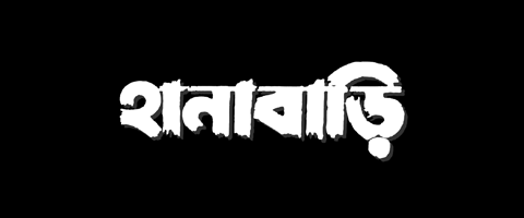
02. Hanabari, 1952

03. Ganga, 1959
This search for a “Bengali look & feel” inevitably influenced the shape of Bengali letters through advertisements, hoardings, cover arts. This would also, inevitably, start reflecting in the film title arts. And that one of those aforementioned designers would go onto become the most important filmmaker of the region surely helped.

04. Devi, 1960
The sort of playfulness Satyajit Ray brought in his title letters (with Devi in 1960, for example) proved contagious.

05. Benarasi, 1962

06. Shesh Anko, 1963

07. Chhayasuryo, 1966

08. Chhuti, 1966

09. Aponjon, 1968

10. Goopy Gyne Bagha Byne, 1968

11. Kokhono Megh, 1968
Over the next few decades the Bengali letters in film titles saw a wide-range of experiments – from the sophisticated, to the modern, to the coy, to the outrageous & the outré – but throughout with a great display of skill & imagination.

12. Suksari, 1969
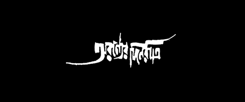
13. Aranyer Dinratri, 1970

14. Bilombito Loy, 1970

15. Dui Prithibi, 1970

16. Dhonyi Meye, 1971

17. Naboraag, 1971

18. Kayaheener Kahini, 1973
The 70s saw the most varied & innovative experiments in film title art. Influences ranged from all forms of Western typographic trends – classical typography, French poster lettering, Art-Nouveau, German Prints, Constructivism, Pop, Psychedelic Art, to name a few – as well as all sorts of local trends of ornamentation, resulting in a wide array of forms & shapes that enriched the Bengali letterforms like never before.

19. Amanush, 1974

20. Nagor Darpone, 1975

21. Nidhiram Sarddar, 1976

22. Ashadharon, 1977

23. Paroshuram, 1977

24. Duratwo, 1978

25. Singhoduar, 1978

26. Akaler Sandhane, 1980
This process slowly started saturating itself during the 80s, when we see the same old formulae being repeated with a marked lack of imagination (though with enough of technical skill to still survive).

27. Dadar Kirti, 1980
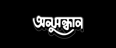
28. Anusandhan, 1981

29. Swarno Mahol, 1982

30. Chheleta, 1986

31. Lal Mahol, 1986

32. Rudrobeena, 1987
Then something started happening in the 90s. Among the consequences of the so-called digital revolution was the gradual drop in certain types of manual skills. Previously, the titles were designed on paper – on notebooks, graph-sheets, stray papers – with the artist working & reworking the design entirely banking on his memory of the subtle nuances of the letterforms. These designers had a supreme grasp of letters & their shapes, & it reflected in the solid typographic feel of these logos or titles. With computerization of the process all artworks were being created with varied computer applications with available fonts to be tweaked & modified at will. We slowly start seeing a sharp drop in skill, though sometimes rather intended – induced by a sense of search for a new look, a new mode, in an attempt to break away from the heavy and structured look of the 80s.

33. Antordhan, 1992

34. Tahader Kotha, 1992

35. Charachar, 1993
Of course, we also see the odd spark of brilliance reminiscent of the old days, but that spark became rarer & rarer.

36. Antoreen, 1994
Another crucial aspect is the return of urban population to Bengali films due to television & later multiplexes after a couple of decades of estrangement when the urban viewers turned to Bollywood & then Hollywood, & mainstream Bengali films mainly catered to sub-urban or rural tastes. The new urban Bengali cinema needed a new identity. This, coupled with a growing dislike for those solid & heavy letter-shapes so overdone throughout the 80s without much imagination, demanded a new aesthetic.

37. Juganto, 1995

38. Ajob Gayer Ajob Kotha, 1998
With films like Utsab (2000) we started seeing a new trend – the brush script.

39. Utsab, 2000

40. Hothat Brishti, 2002

41. Mando Meyer Upakhyan, 2002
These calligraphic brush flourishes served another purpose quite often tried by art-house filmamkers of the past – to distinguish & distance itself from its more commerce-dependent cousin. If we look at title arts of 60s & 70s, it is difficult to decipher the nature of the film from titles. Both commercial & art films were engaged in a similar kind of playful exploration of the letters. From time to time there would be an odd attempt to create a different, artier look – as evident in Duratwa (1978) or Akaler Sandhane (1980). But it never became a norm. From the year 2000 onwards, the distinction between two categories of films became more easily identifiable.

42. Patalghor, 2003
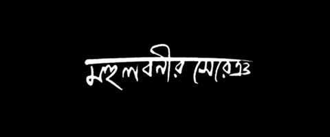
43. Mohulbonir Sereng, 2004

44. Warish, 2004
The new calligraphic brush strokes suddenly became the language of art-house & new-urban titles. But these titles, though most often serving the purpose efficiently, are nonetheless heading towards a dead-end of letter-shapes. Many of the calligraphers today are surprisingly ignorant of the typographic nuances of Bangla.

45. Herbert, 2006

46. Tista, 2008
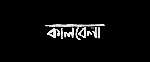
47. Kaalbela, 2009

48. Jamai Raja, 2009
The fine-art of Bengali letters always had two main orientations – let me term them, somewhat vaguely, as the typographic & the calligraphic. The former started with the British founding the first type foundry in Hooghly in 18th century, and the rigorous explorations to define the printed shape of the letters that ensued. The typographic explorations of Bengali letters always followed the popular typographic trends in the west. The second school was the calligraphic style – the trained flourish of the brush – mostly imported from the Far East & its rich tradition of brush-wielding, disseminated through the Santiniketan school. Satyajit Ray, a fine exponent of both trends, himself acknowledged the influence of Benodebehari Mukherjee (one of his teachers in Santiniketan) in his calligraphy. Today, more than ever, this second mode is dominating the scene in Bengal, as is evident in book covers, magazines, advertisement, as well as in film titles – and as with any dominating force, it’s not pretty anymore. On the other hand, the typographic trend is dying a sudden inglorious death.
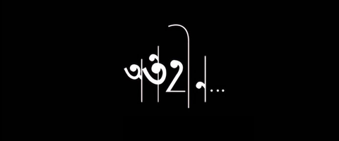
49. Antoheen, 2009
What lies in the future of Bengali letters? I am mildly excited by a few recent titles – Antoheen (2009) being one of them. It’s elegant, light, sophisticated, & – most importantly – it has refused to take sides, standing on both trends, yet acknowledging none.
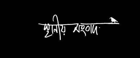
50. Sthaniyo Sangbad, 2010
![]()
Apologies Etc. The 50 Title-Art examples showcased above are not necessarily the “Top 50”. They are chosen primarily because they demonstrate certain trends efficiently. Further, these title arts are mainly from the Kolkata film industry, and the article does not cover Bangladeshi films. We would love to cover that history in another article in future. We also regret not finding all the names (barring a few) of the designers, & as a result we are leaving all the titles unattributed. We understand the necessity of attribution, & would greatly appreciate any clues offered. Lastly, we present these works in black & white chiefly to highlight the shapes & contours of letters, and to provide uniformity for comparison. We do understand how often the shapes work in the context with all its attributes – colors, textures etc. But for the sake of our perspective & direction of research, we preferred to strip them of “un-typographic” aspects & present the bare shapes. Thanks.
![]()
© Rarh Design Studio, 2010
anonymouse / 09 Oct 2010