
![]()
Old & New
![]()
Any survey of the letters & types on display at the Kolkata Book Fair risks sounding like a short-hand assessment of the state of Bengali letters itself. Where else would you find a larger & more diverse assembly of letters & types from different ages of Bengal, with books & publications both new & old? By old I don’t mean only the old of paper, the yellowed ones, but also: the old of memories, the reprints and the new editions. Some even had the original designs, with their classic lettering.


Some of these were curious & wildly crazy, and could even make you forget the disappointment arising from the homogenized & nearly template-ordered covers of the recent books from Ananda Publishers. Majority of their books (many of them being old classics repackaged) come with titles in that same Lino typeface, the same typeface that’s used in the body-text too.

There was a time when Ananda used to be the agency of change & refinement in matters typographic in Bengal. Some of their recent ventures have fallen short in this regard. Fortunately, they have left a few major books and their classic designs untouched and among those are, predictably, the Satyajit Ray classics.

The house of Ananda is also marketing the old Signet Press books (of the legendary DK) with their iconic looks untouched. And they are marketing these books as Signet-er Boi, which I think is great. Many of these too were designed & illustrated by Satyajit.

![]()
The Art of Artlessness
![]()
One great assurance you draw from the book fair is that the world of Bengali letters & types is very much alive, and as a tradition it is self-conscious in a good way.

But, the progress of the art has been linear: its concerns are still very much modernist, its consciousness very much Kantian. Mostly, the problems are purely formal, matters of technique & of making. And you realize that the major issue for this industry has been one of taste: to eliminate clichés or even the marks of the popular.
And it’s working too, but for a small section. In the new designs & lettering styles, one spots a striving after a sense of artlessness, and I find that refreshing.

Of course, artlessness as an idea is vague & relative, and hopelessly bound in sense to time. And then, it can also appear in different guises.

![]()
The Faux-Naïf
![]()
Often the faux-naïf or amateurish styles express a sense of artless elegance. Usually, the faux-naïf communicates at multiple levels: it discards traditional markers of skill & technique, while communicating the designer’s skill through unusual or unexplored channels.

It can be a delicate balance between the virtues & the vices of a craft, and often achieved by reversing this polarity.


![]()
The Retro
![]()
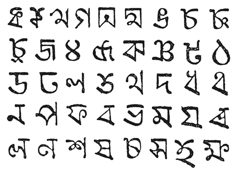
Sampling of old types has always been a fashion. Some of the old types embody in their awkward & crude-cut silhouettes a pure & noble artlessness. Their shapes are often free of contemporary clichés. We have seen the obsolete typefaces of Charles Wilkins, the Serampore Mission Press & the Bat-tala revived before in the recent past, often arbitrarily.

I am not criticizing ‘arbitrariness’. I recognize arbitrariness as the very basis of using & applying of typefaces around the world. How many modern Indian books are being set with typefaces developed in modern India? And if typefaces used in a design had to be culturally or temporally connected to the content, then we’d have to stop using most typefaces we know today. And yet, in spite of this, we do realize the evocative powers of letters (after all, that is what this is all about), and that power often transcends our limited understanding of ‘connectedness’. This year, we are seeing a sort of mini-revival of Wilhelm Bolts’ Bengali letters – letters that were universally rejected & ridiculed when it was first conceived in 1773. This is a great tribute to a pioneer who never got his due.


There are also attempts to recreate the charms of the letterpress, by recreating its effects.


Often the retro is associated with the ornate, and one did notice a few on display this year. However, it also shows how difficult it is to handle it.


![]()
The Geometric
![]()
The gradual fading of the traditional typographic or geometric lettering styles is always sad. While still newspapers & magazines have such mastheads, its presence in the publishing media has diminished considerably.


And yet, these chunky geometric expressions too are surviving through reinvention, and slight extra-structural additions, like a touch of calculated naiveté or a little handmade-roughness, promise to refresh the entire process. In fact, the marks of the bare hand are in favor like never before.

The hand-crafted look—a little roughness, or a studied anarchy, cultivating errors & irregularities, textures & grains, and often the painterly effects, anything that contrasts readily with the traditional ideas associated with machine-aided productions—appears to be on a permanent and continuous return.

![]()
Calligraphy
![]()
Nothing reminds you of the hand & its energy, its controlled wildness & unpredictability, like calligraphy. In the recent years, calligraphy has become the dominant mode of display lettering in Bengal. And Bangla calligraphy has, over the recent few years, sort of forged a distinct identity.


Many of its nuances & modalities are borrowed from the farther east, the Chinese & the Japanese, and its not still as rich in technique; but nonetheless, its showing signs of a “coming of age” of sorts. Which means, Bangla calligraphy also appears to be looking into new directions to avoid its own piling heap of clichés, and is striving to find characteristics essentially local & Bengali.
Along with technical experiments with the brushes or the surface, we are seeing new modalities being introduced.

The sweeping flourishes are giving way to shorter strokes. The overall bind and weave is becoming easier & casual. Sometimes bold & emphatic assertions are being used. In fact, some of these bold strokes are functioning like anchor lines around which the rest of the strokes are composed.

When we look at calligraphy & lettering we look for stories behind the forms, traces of energy & personalities behind shapes. But not in a graphological sense: the personalities we find are not individuals, but certain states of mind, moments.

![]()
Marks of the Hand
![]()
If you meet designers who are actively interested in the shapes of Bangla letters, you will notice that the majority started out before the waves of the digital found these shores. In those days, knowing the letters & mastering lettering techniques were a part of the act. Computer-aided designing (with its ready repository of ‘fonts’) has severely damaged this relation. It proved worse for Bengal. The majority of the designers today completely rely on ready typefaces.
Surfing a totally different kind of taste, for example, the television industry relies mostly on ready typefaces for the show IDs etc, which are produced in-house, as one can see from these banners.


This generation’s dependence on ready fonts for titles & displays is alarming. It might work in other scripts, like in Latin-based languages, where the richness offered by available typefaces is considerable. If the available Bengali typefaces are to be reckoned, the number of “really good” typefaces will oscillate—depending on the reviewer’s mood—between less than a handful to neighboring zero. Very soon the titles start looking the same, without a character or a personality. The vast possibilities of Bengali letters & their shapes soon exhaust themselves through a few available shapes.

And then, with calligraphy & lettering you can always end up doing something very special. With typefaces, the individual shapes are neutrally designed to work ‘fine’ in millions of different combinations; in lettering & calligraphy the shapes are pushed & tailored to the hilt to work best in one special combination alone.

You always know that the culture of lettering will continue to produce uniqueness, little digressions & surprises. They will continue to expose hidden relations & create new ones between shapes. And that is how the many lives of the letters unfold & open up in this extraordinary garden of shapes, everyday. Somehow, it’s deeply reassuring.
![]()


![]()
Apologies Etc.: It was not possible to attribute the works to designers and painters involved: Rarh Design Studio regrets this. Mostly, the works of art reproduced on the blog were cropped or framed beforehand to stress the typographic aspects of the designs only.
![]()
© Shubho Roy, 2011 / Photographs: Prithwish Das & Shubho Roy
Brian / 13 Feb 2012