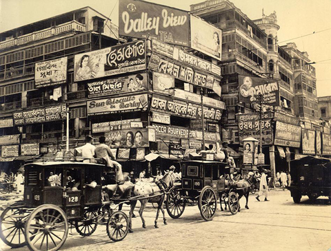
The 60 photographs by Clyde Waddell in the Van Pelt Library make for an invaluable sepia-hued study of Kolkata in the 1940s. One picture in particular stands out. It’s a usual business day in the city. We see horse-drawn coaches plying the asphalt, laid wide & furrowed by tram tracks, in a busy mercantile neighborhood. In the background, people are moving about dark colonnaded galleries of storied commercial buildings that are plastered with signage. Waddell, a young American GI in south Asia on war duties, later recorded in the photograph’s caption his perplexity: “a bewildering mass of billboards at the corner of Harrison Street…”

Photograph by Clyde Waddell, 1945. (The Van Pelt Library)
The photograph, it struck me, reveals an aspect of typography & lettering traditions in Bengal, especially that of what’s being increasingly called vernacular typography. It’s a useful word, vernacular, and I am using it to imply a wide range of practices related to the local craft of signage lettering & typography. It is distinct from the mainstream print & advertising typography, and the larger network of corporate-driven practices.
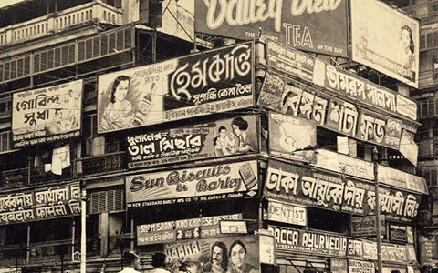
What puzzled me initially was that, despite its datedness & the obvious period elements, something about the photograph looked disturbingly contemporary. As I studied the picture, I realized it’s the typography. It’s the typography, and how little there has been in the way of change in the 70 odd intervening years in Bengal: from the overarching aesthetics than govern the craft, to the lettering techniques & typographic nuances.

(Detail) Photograph by Clyde Waddell, 1945 (The Van Pelt Library)
Some of the billboards here represent the corporate of the day, and while the advertising language & the corporate trends have changed since this moment a thousand times over, the vernacular traditions are still very much the same, inspired by the same aesthetic. And this is probably what accounts for the quaint charms of vernacular typography: it is inherently anachronistic. Or even, achronistic, existing outside of time. More significantly, it exists outside of the global corporate culture, and is not a part of its cycles of design trends & values that are refreshed in rapid succession.
Trends are often meant to express the prevalent cultural values or aspects of technological advancement. Principles, practices & products that cannot satisfactorily express these values fall out of favor & turn outdated. Typographic forms too are susceptible to these cycles. Vernacular signs, however, show a curious synchronicity of different styles & nuances from different periods.
This can lead us to a different definition of vernacular typography. I am increasingly in favor of trying to understand it—not by its inherent characteristics but—by its complex relations to the mainstream design practices. The term vernacular itself is understood within its polar relation to an elite or a dominant culture.
dhrupadi / 23 Jan 2013