
Not until 1770s did the Bengali language find itself in the printed form.
Like in Europe, as Benedict Anderson [Anderson, 1983] argues, the introduction of movable types not only changed the Bengali language itself, it was to change the entire culture of Bengal & its politics. The Bengali consciousness formed out of the printed language and its dissemination, as the isolated communities became connected through the standardization of language.
When Nathaniel Brassey Halhed (1751-1830) made up his mind to compile and publish the first book of Bengali grammar in the late 18th century, Bengali as we know it was still unformed. A serially interrupted history (of being ruled by foreigners who came with their own languages), a lack of a classical literary heritage and a standardized grammar, and the written forms mainly being poetry (much removed from the vernacular or spoken forms), among other reasons, amounted to a language still very much in the making.
There were other problems of a more technical nature: the glyphs were not well-defined and varied widely, as hand-copied manuscripts were the only form of dissemination. There were often more than one recognized glyph representing the same letter. It took more than a century to standardize the forms, the grammar, and the spelling has not been standardized fully yet. One of reasons was the issue of Bengali being perceived as a corruption of Sanskrit. There is, of course, no language that is not a corrupted form of another. But the struggle to break away from its Sanskrit roots is still a problem (in less obvious forms) even after a century and a half of literary developments almost unparalleled in the subcontinent. Even today the official spelling policy is to disregard the native phonetics.
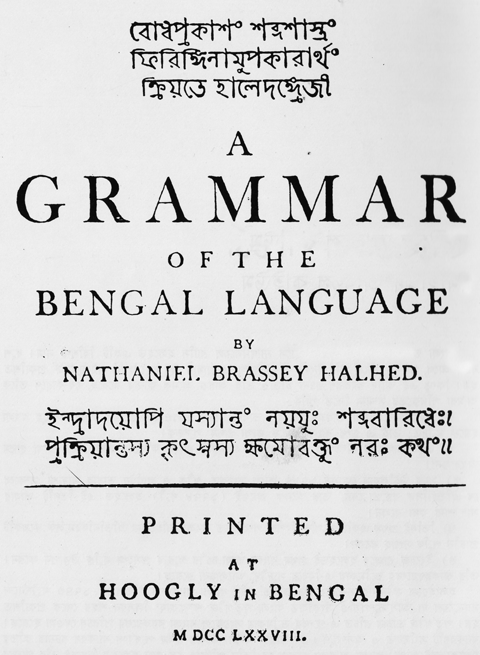
Among Halhed’s chief concerns was to be able to print in Bengali. Though in English, A Grammar of the Bengal Language (1778) needed extensive use of Bengali. Bengali as a language had been in the printed form earlier. Halhed’s own A Code of Gentoo Laws (1776) had a block printed page of Bengali alphabets. But for Grammar he needed Bengali movable types and a foundry that could make them.
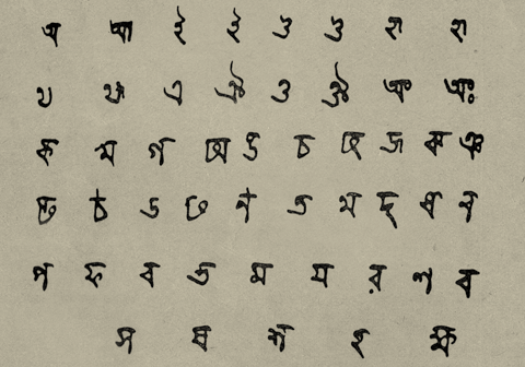
From A Code of Gentoo Laws, 1776
Halhed’s attempts to have Bengali types cast in the foundries of England always ended in disappointment. One learns that Halhed had contacted the notorious (Dutch-born Englishman of German origin) William (Wilhelm) Bolts (1740-1808), an ambitious & later disgraced British East India Company worker, who was known to have undertaken the task of designing Bengali types (in collaboration with Joseph Jackson’s SALISBURY SQUARE FOUNDRY, which would later become CASLON & SON) in 1773. But Bolts’ efforts were found wanting in several aspects and were almost universally rejected.
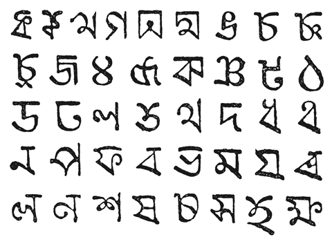
William Bolts' Bengali Letters, 1773
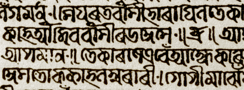
In 1777 Warren Hastings (1732-1818), the then Governor General of Bengal and a close friend of Halhed, assigned Charles Wilkins (1749-1836), a civil servant in East India Company, to design & supervise the creation of Bengali types. Working closely with a native smith Panchanan Karmakar (1730?-1804), Wilkins finally created a set of Bengali movable types that impressed all. In 1778 Halhed’s A Grammar of the Bengal Language was published with parts of it printed in Bengali with the movable types designed by Wilkins and his associates. In the introduction, Halhed expresses gratitude and praises the achievements of Wilkins in the production of the book, commenting how the latter “exceeded all expectations”. From Halhed’s writing we also realize how “in a country so remote from all connexion with European artists, [Wilkins] has been obliged to charge himself with all the various occupations of the Metallurgist, the Engraver, the Founder & the Printer”, to singly achieve what, in retrospect, is nothing short of a revolution.
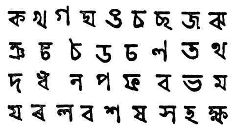
Wilkins' Letters, 1778
The glyphs of Wilkins’ type, though recognizably Bengali, is nonetheless much removed from the modern letterforms we are familiar with. Compared to Latin types of the same period they look archaic and inconsistent. But considering complexities inherent in the Bengali letters and their forms, and that all else had failed to even produce one, Wilkins’ movable types were a real achievement.
Problems of producing a workable Bengali type are many. First, the letterforms are much more complex compared to Latin forms. Then apart from the vowels & consonants there are a swarm of modifiers, conjuncts and contextual forms. The U-modifier, for example, has more than 15 different contextual forms depending on which consonant it is modifying. There are conjunct ligatures running into hundreds. A fully functional Bengali typeface should have more than 500 glyphs. Of course, the number has been reduced since through simplifications and introduction of half letters that form conjuncts in combinations.
The role of Panchanan Karmakar, the smith who ‘wrought with Wilkins’ arises much interest in recent studies. We find both kinds of documents (and later scholarship) where the role of the native smith is, contrastingly, either ignored or exalted. Both Wilkins and Halhed found Panchanan’s role insignificant or minor enough to ignore. So have many later writers. But we also find documents where observers took a more generous stand and commended the Bengali craftsman’s role in the whole enterprise. Joshua Marshman (1768–1837), who had played an active role in the printing revolution in Bengal, spoke of “a native named Panchanan, of caste of the smiths, who has been instructed in cutting punches by Lieut. Wilkins, and had wrought at the same bench with him in cutting Bengali fount of types.”
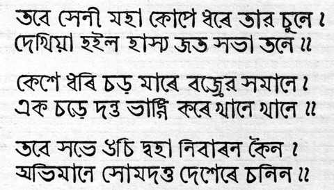
Detail from Halhed's Grammar, 1778
That Panchanan would later be brought to SERAMPORE MISSION PRESS by William Carey (1761-1834) to take a leading role in the foundry is well documented. The achievements of Panchanan & his associates at the Mission were indeed notable and will be discussed later. But his role in Wilkins’ project is still at the mercy of interpretations. There should be no conspiracy theory though: Wilkins achievements remain pure and astounding given the circumstances he worked in, whether singly or with all the assistance he could hire, for with Wilkins what began was a process that would not only change the cultural, political & psychological map of Bengal, it was to have a significant bearing on the entire subcontinent. He was far more than the pioneer of printing in Bengal, as his credentials as a Sanskrit scholar is equally pioneering. But his contribution to the art of printing is well acknowledged in the form a “doggerel verse” in the Asiatic Annual Register, 1801:
See patient Wilkins to the world unfold.
Whate’er discovered the Sanskrit relics hold,
But he performed a yet more noble part
He gave to Asia typographic art.
![]()
With this first installment, we have started the series on the history of the Bengali type. One of the purposes of this, apart from sharing all the information we have, is to share all the rare images we have been collecting and archiving over the years. We are also planning our online archive – of prints & patterns of these regions, documentation of anything that involves design from textile to architectural motifs to commercial art in Bengal (old typefaces, advertisements, illustrations, packaging of local brands etc.) – which might in future prove to be a veritable resource for the student of design. On the obverse, the objective of this undertaking is to create a pool of visual data which can be analyzed and built upon to forge new languages for future.
![]()
© Rarh 2010
Typography from Bengal | Its a Nerd's Life! / 21 Nov 2010