
During a short trip with friends to Mandarmoni beach in the south of Bengal I as usual scavenged types & letters from roadsides.
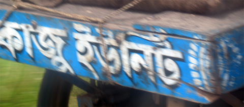
Hand drawn letters at the back of a rickshaw Van
As all of us were in hurry to get back with unread emails piling up in our mailboxes, I tried my best to pluck blurry letters from a fast moving landscape.
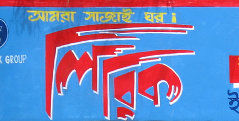
Hand drawn advertisement on a wall
On Durgapur Expressway we stopped at a Café Coffee Day shop flaring its new brand avatar against a darkening sky. CCD in its 13 years has become the largest coffee shop chain in India. Though the new branding — created by the famous Landor Associates — was unveiled in January this year, it took some time to upgrade all the 1000 odd shops around the country.
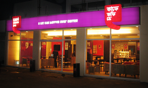
The Cafe Coffee Day on Durgapur Expressway
The branding is very carefully planned out and well executed, if only a tad cutesy in its approach. But I guess it works fine with today’s youth at whom it’s expressly targeted. The logo is trendy in the bad sense of the term.
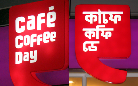
The English & Bengali versions of the CCD logo
But what disappointed me was the Bengali type used for the logo’s Bengali avatar. It surely could have been better and more intuitive while maintaining the brand look. The thickness of the horizontal mark (the matra) cramps the beauty of the letters & their curves. Unlike in Devanagari characters, where the horizontal mark is indispensable, in Bengali letters the matra has a diminished importance today due to handwritten practices. As a result, many Bengali logos & creative typography either underplay the matra or drop it altogether. Sometimes the matra is even suggested like serifs of Latin letters instead of a continuous line, like in the current Anandamela magazine nameplate (which is a modified version of the older design done by Satyajit Ray, who also used similar serif-like disjointed matra).
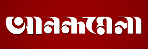
The Anandamela logo with a disjointed matra
Since in the English version of the Coffee Day logo the characters are unleveled & unevenly placed, one expects a similar style in the Bengali letters with the matra left out, or suggested. Another problem with this design is the lack of an intuitive feel for the curves & their relations, as is obvious with the e-modifier, which ruins the design totally. The Bengali avatar of the CCD logo, though probably not done in Bengal, may just be typifying what is ailing the professional design scene in Bengal – bad typography.
![]()
© Rarh Design Studio 2010
Sarang Kulkarni / 03 Jun 2011