For a long time I have been meaning to write something about what is now known as industrial design, and at the same time, always wanted to pay homage to the elaborate design culture of Japan. And it is no surprise that the favorite story of applied and industrial designers is a telling tale of Japanese sophistication, even though, in this case, one from a pre-industrial Japan. Japanese design is known for various exemplary virtues, not least of which is its great attention to details, even when it involves designing something as rudimentary in form & function as a simple toothpick.
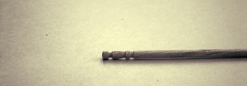
Though it retains its basic monolithic form always, and for obvious reasons, toothpicks nonetheless come with some superficial variations these days: there are both one-sided & two-sided toothpicks, decorated ones, austere squarely faceted ones, ones made of plastic, as well as the more common which are wooden. One popular variation of this is the one-sided toothpick, a rounded wooden prong with one sharp tapered end and one blunt end: the blunt end of it has slightly beveled rounded grooves, apparently functioning as a decoration…or so I thought.

The traditional Japanese toothpick, with turned grooves.
The design world since the beginning of 20th century has been divided about the role of decoration: whether forms should be strictly functional, or do decorations too have a function (albeit sometimes of a more immaterial nature). It was a classic modernist debate, one which in the last 30 odd years has been carefully ignored, if not academically ridiculed. And sometimes rightfully, I can’t but add, but also, sometimes, at one’s peril: especially when we look back at what happened when the functional took a back seat.
Now, it seems where this particular decorative variation of the toothpick in question developed, in Japan, these grooves had a very specific function. In Japan, one hears, the toothpicks were placed on the table mat, by the food. Of course the idea doesn’t sound very hygienic, as the parts of the toothpick that would eventually enter the mouth could be touching the surface of the table. So the design of the toothpick carried an in-built solution. These grooves, one learns, were there so the user could neatly nip the blunt end off, and use this nipped off part as a tiny stand where the sharper end (the “business-end”) of the toothpick could rest, elevated from the surface of the table. This is a great example of—not only how social values can be encoded in the design elegantly, but also—how the functional segmentation of designs can be used as decoration through proper styling of the contour, where decoration serves both purposes.

The nipped off end functioning as a “Toothpick Rest”.
The irony is that in this age of industrial production, where millions are spent for design development, this particular design is often replicated in plastic & other synthetic materials, where the blunt end can’t be broken off along the incisions, reducing this nice distinction into, well, a mere decoration…
![]()
© Rarh Design Studio, 2011
Nana / 21 May 2011