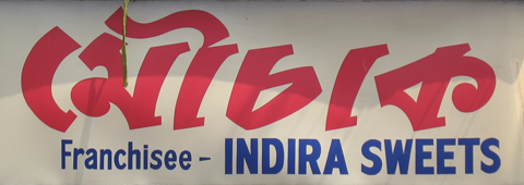
Mouchak is a rather famous Bengali sweetshop chain in Kolkata. For some living in the city, I am told, the brand readily prompts sentimental associations. For those of us who grew up elsewhere (and on other brands of sweets), Mouchak sweetshops are good pointers most commonly referred to as unmistakable landmarks in Kolkata to find one’s way out in the city. Mouchak outlets are convenient meeting points, as every important junction in the city appears to have at least one! However, neither can I recall with confidence the savor of its sweets, nor if they are famous for any particular confection or any unique quality. But I knew it’s big bold hoardings (I had to, to find my way around Kolkata).

The traditional Mouchak hoarding; Dhakuria, Kolkata.
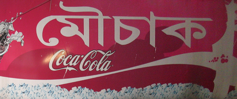
A couple of months back (again asked by a friend to wait by the Mouchak outlet at Golpark), I noticed a new Mouchak hoarding. Not that I am big fan of the traditional Mouchak logo, but it’s always sad to see ready-made fonts replacing hand-crafted letterings. The new Coca-Cola tagged Mouchak hoarding really left a bitter taste.

The Coca-Cola Mouchak hoarding at Golpark, Kolkata.
The Linotype Bengali font (designed for Anandabazaar Patrika initially) & its numerous counterfeits doing rounds may work fine for body-text in newspapers (for which they were originally intended), but they look ugly and exposed when blown up as display faces. Little flaws tend to draw your attention. And when coupled with mindless tracking or lack of kerning, they can be hideous. Like here. The problem with these local brands is that they are not in the least concerned about branding or brand-building. As a result, each outlet is at liberty to redesign the hoarding or the logo. With different types & styles of lettering. This way, Mouchak hoardings will no longer be recognizable from a distance, which is a bad thing for the brand, but also for us who are not that well-versed with the city and its streets…
![]()
© Rarh Design Studio 2010