Any student of branding will notice with alarm the trend that emerges out of the recent rebranding of Microsoft and Ebay: it is this idea of going clean & Swiss with the typography.

Actually, the trend has been around a while now, and we have all done that at some point. And it is also true that the new logos may be typographically more sophisticated; the semantics of shapes that form the basis of expressive lettering is overused & exhausted. The clean & objective typography is rid of such baggage. However, what is worrying is that this simplicity is being achieved at the cost of unique silhouettes.

Microsoft has discussed the virtues of the pretentiously titled Metro Style—the style that shapes the logos of both the Windows 8 & the Microsoft—and how it is inspired by the Swiss Style. Swiss can mean many things. The old Microsoft logo too was set in a Swiss typeface, Helvetica.

The old Microsoft logo, set in Helvetica.
However, the Swiss Style is something else. Swiss Style is a style of communication design, also known as International Typographic Style, which, as Wikipedia informs us, “emphasizes cleanliness, readability & objectivity”. It is also known for its communicative efficacy. And that’s when you realize the true nature of the trade-off: that communication is being favored over expression & storytelling.
The same could be said of a host of other brands who are gradually buying into this trend. The typography in these new logos says nothing about the brands: the neutral uncommitted shapes return our gazes empty. There is no story to be found in them. They communicate, but they fail to engage & build relationships. And yet, great brands have always been about great stories that captivate us.
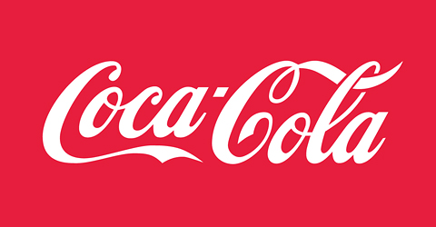
Coca-Cola.
Brand stories are the narrative relations between various ideas & senses produced by the brand. If brands are themselves abstract entities, the stories they produce are what makes them human. If Coca-Cola is the name of a gigantic planet-wide operation, its monstrosity is partially absolved by the human associations & stories that the brand & its recognizable shapes evoke.
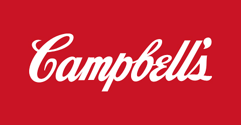
Campbell’s.
Logos like Coca-Cola’s or Campbell’s also carry their own rich histories in their shapes. They are like monuments from the past that should be preserved, because they carry vital stories of the culture that produced it:
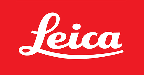
Leica.
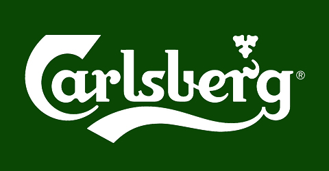
Carlsberg.
Miller.
Cadbury.
I don’t mean to suggest that all logos have to look like calligraphy or vintage lettering. I am thinking character, attitude, stories, dreams. One can never prescribe what great design should be like. It can very well be about dreaming up new forms, imagining the future:

IBM by Paul Rand.
The typography of the IBM logo is like an old science fiction that imagined how the future in 1990s would be, but never accurately: IBM is how Paul Rand imagined the future.
One can always argue that the new attitude too is the product of our age. In future, perhaps half a century from now, this too will be looked back at fondly. But I am not willing to subscribe to that thought. We are living in perhaps the most exciting phase in design history, with the plurality of talent & resource opening up such a multitude of directions. To think that what represents all this is a string of clean & sober letters standing still like incorruptible royal guards is depressing at best. What we need is letters with attitude. Smaller brands, with less at stake, are always more creative. It is the bigger brands—and designers—of the day, who are increasingly opting for safer solutions, that must again start being adventurous. Or even, just be mad or outrageous with the typography like they could be in the past:
Pirelli.
Actually, it is great to see a brand like Pirelli standing by their vintage logo. In a short note on the history of the logo, Pirelli says, “Today any further innovations or changes to the logo seem impossible.”
The Ferrari word mark, without the symbol.
Coming back to Paul Rand, the designer was involved in another famous rebranding story: that of the Ford’s logo. The prototype of the current Ford logo was first implemented in the early years of the 20th century, and though the typography has been fine-tuned many times since, it still retains its old world charm.
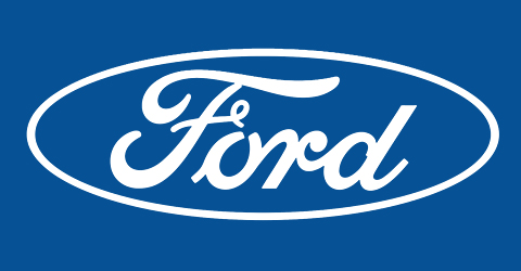
The current Ford logo.
In the 1960s, Rand was asked to re-imagine the logo. Rand’s version was a brilliant modernist reinterpretation:
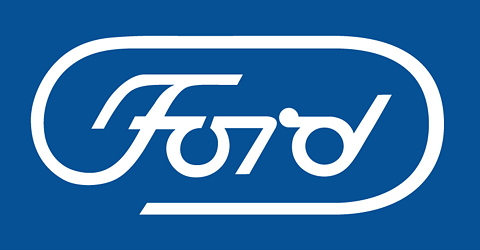
Paul Rand’s Ford redesign.
But by rejecting Rand’s radical redesign in favor of the old one, Ford actually may have escaped the Sisyphean cycle of perpetual rebranding. In the end, Henry Ford II may have taken the right decision, after all. Perhaps he understood that a brand—like a city or a culture—needs to preserve its own mythologies. It is precisely this kind of farsightedness that the branding industry needs today.
![]()
© Shubho, 2012.