Rarh Design Studio completed the branding for Verb, a new film production house in Kolkata started by three very enterprising young talents – Santanava Roy, Manish Golder & Indranath Chatterjee.
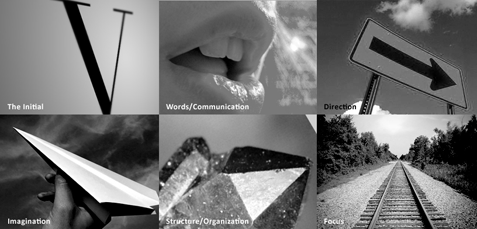
We started by analyzing the brand name & what it communicates. The aim of this process was to generate keywords which will help us visualize the brand.
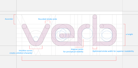
The first phase of the branding process comprised of crafting a wordmark for Verb. None of us wanted to use any available font in the market and instead wanted a distinct look. After much plodding and tweaking we settled for a rounded and easy flowing silhouette. Below you can see the typographic logic behind the construction of the wordmark:
The second phase was designing a brand mark, i.e. the symbol, for Verb.
We started by visualizing the keywords and trying to arrive at a basic shape which will not only express the essence of the brand & its meaning, but will also represent the various aspects associated with the name.
After much slogging upon the drawing board we reached a simple & maneuverable shape:
The final mark resembles a pair of stylized inverted commas (=word=verb) as well as a pair of simplified hands about to form a frame.
This phase also saw us defining the brand parameters including the color scheme.
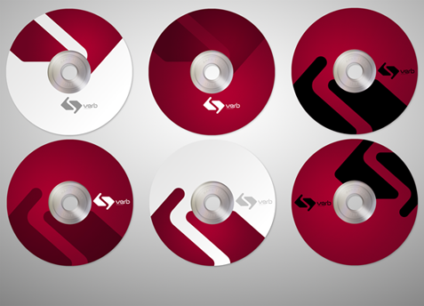
The stationeries came out well, with a young and sort of sporty feel (which I think defines the boys involved well).
We wish all the best to Verb.
![]()
Project Details:
Client: Verb Films
Location: Kolkata
Description: Logo & Brand Development for Verb Films
Year: 2010
Studio: Rarh Design Studio
Designer & Typographer: Shubho Roy, Rarh Design Studio
![]()
© Rarh 2010



faruk / 12 Sep 2010
blogta valoi laglo.paintings r cartoon nei kano?
somvob hole bishoyta ektu detail janio.
jante chai kivabe lekha r chobi pathabo.